Introduction
Welcome to the in-class portion of the visualization workshop in Python! Feel free to work in either a Jupyter Notebook or a typical text editor/IDE, depending on your preference.
If you would like to use a Notebook, you can download that here:
Otherwise, you can follow along here and use the following skeleton code provided in a Python file:
In case you don’t finish, there are, of course, solutions provided:
With that out of the way, let’s get started!
The Data Set
In today’s workshop, we will revisit the data set you worked with in the Machine Learning workshop. As a refresher: this data set is from the GSE53987 dataset on Bipolar disorder (BD) and major depressive disorder (MDD) and schizophrenia:
Lanz TA, Joshi JJ, Reinhart V, Johnson K et al. STEP levels are unchanged in pre-frontal cortex and associative striatum in post-mortem human brain samples from subjects with schizophrenia, bipolar disorder and major depressive disorder. PLoS One 2015;10(3):e0121744. PMID: 25786133
This is a microarray data on platform GPL570 (HG-U133_Plus_2, Affymetrix Human Genome U133 Plus 2.0 Array) consisting of 54675 probes.
The raw CEL files of the GEO series were downloaded, frozen-RMA normalized , and the probes have been converted to HUGO gene symbols using the annotate package averaging on genes. The sample clinical data (meta-data) was parsed from the series matrix file. You can download it here:
In total there are 205 rows consisting of 19 individuals diagnosed with BPD, 19 with MDD, 19 schizophrenia and 19 controls. Each sample has gene expression from 3 tissues (post-mortem brain). There are a total of 13768 genes (numeric features) and 10 meta features and 1 ID (GEO sample accession):
Age
Race (W for white and B for black)
Gender (F for female and M for male)
Ph: pH of the brain tissue
Pmi: post mortal interval
Rin: RNA integrity number
Patient: Unique ID for each patient. Each patient has up to 3 tissue samples. The patient ID is written as disease followed by a number from 1 to 19
Tissue: tissue the expression was obtained from.
Disease.state: class of disease the patient belongs to: bipolar, schizophrenia, depression or control.
source.name: combination of the tissue and disease.state
Workshop Goals
Each task has a required section and a bonus section. Focus on completing the three required sections first, then if you have time at the end, revisit the bonus sections.
Finally, as this is your final workshop, we hope that you will this as an opportunity to integrate the different concepts that you have learned in previous workshops.
Workshop Logistics
As mentioned in the pre-workshop documentation, you can do this workshop either in a Jupyter Notebook, or in a python script. Please make sure you have set-up the appropriate environment for youself. This workshop will be completed using “paired-programming” and the “driver” will switch every 15 minutes. Also, we will be using the python plotting libraries matplotlib and seaborn.
Task 0: Import Libraries and Data
Download the data set (above) as a .csv file
Initialize your script by running the first cell and ensuring the data file is pointing to the correct location on your local computer.
# Import Necessary Libraries
import pandas as pd
import numpy as np
import seaborn as sns
from sklearn import cluster, metrics, decomposition
from matplotlib import pyplot as plt
import itertools
data = pd.read_csv('GSE53987_combined.csv', index_col=0)
genes = data.columns[10:]
Task 1: Visualize Dataset Demographics
Required Workshop Task:
Use the skeleton code to write 3 plotting functions:
plot_distribution()
Returns a distribution plot object given a dataframe and one observation
plot_relational()
Returns a distribution plot object given a dataframe and (x,y) observations
plot_categorical()
Returns a categorical plot object given a dataframe and (x,y) observations
Use these functions to produce the following plots:
Histogram of patient ages
Histogram of gene expression for 1 gene
Scatter plot of gene expression for 1 gene by ages
Box plot of gene expression for 1 gene by disease state
Violin plot of gene expression for 1 gene by Tissue
Bonus Task:
Return to these functions and include functionality to customize color palettes, axis legends, etc. You can choose to define your own plotting “style” and keep that consistent for all of your plotting functions.
Clean up any axis or tick labels so that all labels are clearly visible. This may include playing with text size, rotation, or some other parameter.
# Function to Plot a Distribtion
def plot_distribution(df, obs1, obs2=''):
    """
    Create a distribution plot for at least one observation

    Arguments:
        df (pandas data frame): data frame containing at least 1 column of numerical values
        obs1 (string): observation to plot distribution on
        obs2 (string, optional)
    Returns:
        axes object
    """
    ax = None
    return ax

# Function to Plot Relational (x,y) Plots
def plot_relational(df, x, y, hue=None, kind=None):
    """
    Create a plot for an x,y relationship (default = scatter plot)
    Optional functionality for additional observations.

    Arguments:
        df (pandas data frame): data frame containing at least 2 columns of numerical values
        x (string): observation for the independent variable
        y (string): observation for the dependent variable
        hue (string, optional): additional observation to color the plot on
        kind (string, optional): type of plot to create [scatter, line]
    Returns:
        axes object
    """
    ax = None
    return ax

def plot_categorical(df, x, y, hue=None, kind=None):
    """
    Create a plot for an x,y relationship where x is categorical (not numerical)

    Arguments:
        df (pandas data frame): data frame containing at least 2 columns of numerical values
        x (string): observation for the independent variable (categorical)
        y (string): observation for the dependent variable
        hue (string, optional): additional observation to color the plot on
        kind (string, optional): type of plot to create. Options should include at least:
        strip (default), box, and violin
    """
    ax = None
    return ax

def main():
    """
    Generate the following plots:
    1. Histogram of patient ages
    2. Histogram of gene expression for 1 gene
    3. Scatter plot of gene expression for 1 gene by ages
    4. Scatter plot of gene expression for 1 gene by disease state
    """
def bh_adjust(pvalues):
    from scipy.stats import rankdata
    ranked_pvalues = rankdata(pvalues)
    fdr = pvalues * len(pvalues) / ranked_pvalues
    fdr[fdr > 1] = 1

    return fdr

def differential_expression(data, group_col, features, reference=None):
    """
    Perform a one-way ANOVA across all provided features for a given grouping.

    Arguments
    ---------

        data : (pandas.DataFrame)
            DataFrame containing group information and feature values.
        group_col : (str)
            Column in `data` containing sample group labels.
        features : (list, numpy.ndarray):
            Columns in `data` to test for differential expression. Having them
            be gene names would make sense. :thinking:
        reference : (str, optional)
            Value in `group_col` to use as the reference group. Default is None,
            and the value will be chosen.

    Returns
    -------
        pandas.DataFrame
            A DataFrame of differential expression results with columns for
            fold changes between groups, maximum fold change from reference,
            f values, p values, and adjusted p-values by Bonferroni correction.
    """
    if group_col not in data.columns:
        raise ValueError("`group_col` {} not found in data".format(group_col))
    if any([x not in data.columns for x in features]):
        raise ValueError("Not all provided features found in data.")
    if reference is None:
        reference = data[group_col].unique()[0]
        print("No reference group provided. Using {}".format(reference))
    elif reference not in data[group_col].unique():
        raise ValueError("Reference value {} not found in column {}.".format(
                         reference, group_col))
    by_group = data.groupby(group_col)
    reference_avg = by_group.get_group(reference).loc[:,features].mean()
    values = []
    results = {}
    for each, index in by_group.groups.items():
        values.append(data.loc[index, features])
        if each !=  reference:
            key = f"{each.replace(' ', '_')}_foldchange"
            results[key] = np.log2(data.loc[index, features].mean()) \
                         - np.log2(reference_avg)
    fold_change_cols = list(results.keys())
    fvalues, pvalues = stats.f_oneway(*values)
    results['f_value'] = fvalues
    results['p_value'] = pvalues
    results['neg_log10_pvalue'] = - np.log10(pvalues)
    results['adj_p_value'] = bh_adjust(pvalues)
    results_df = pd.DataFrame(results)
    def largest_deviation(x):
        i = np.where(abs(x) == max(abs(x)))[0][0]
        return x[i]
    if len(fold_change_cols) > 0:
        results_df['max_foldchange'] = results_df[fold_change_cols].apply(
                                           lambda x: largest_deviation(x.values), axis=1)

    return results_df
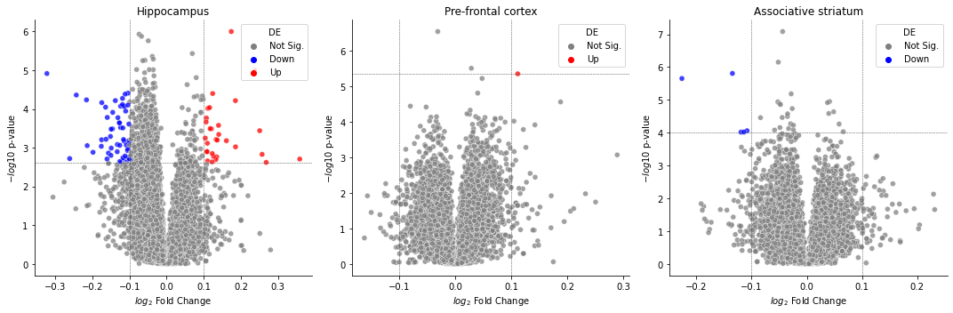
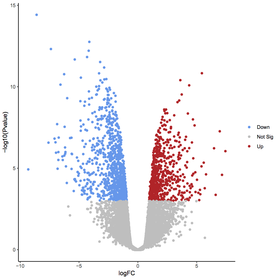
Task 2: Volcano Plots
Volcano plots are ways to showcase the number of differentially expressed genes found during high throughput sequencing analysis. Log fold changes are plotted along the x-axis, while p-values are plotted along the y-axis. Genes are marked significant if they exceed some absolute Log fold change theshold as well some p-value level for significance. This can be seen in the plot below.
Your first task will be to generate some Volcano plots:
Requirements
Use the provided function to perform an ANOVA (analysis of variance) between control and experimental groups in each tissue.
Perform a separate analysis for each tissue.
Implement the skeleton function to create a volcano plot to visualize both the log fold change in expression values and the p-values from the ANOVA comparison
Highlight significant genes with distinct colors
hints: 1. You might find the palette argument for seaborn plots
helpful when coloring each gene 2. Volcano plots are typically a little
strange where significance is determined by adjusted p-values, but
raw -\(log_{10}\) p-values are plotted along the y-axis
def volcano_plot(data, x_col, y_col, sig_col, sig_thresh, fc_thresh):
    """
    Generate a volcano plot to showcasing differentially expressed genes.

    Parameters
    ----------
        data : (pandas.DataFrame)
            A data frame containing differential expression results
        x_col : str
            Column to plot along x-axis, typically log2(foldchange)
        y_col : str
            Column to plot along y-axis, typically -log10(p-value)
        sig_col : str
            Column in `data` with adjusted p-values.
        sig_thresh : float
            Threshold for statistical significance.
        fc_thresh : float
            Threshold for biological significance
    """
    data['significant'] = False
    def get_direction(fc, p_value):
        if p_value < sig_thresh and abs(fc) > fc_thresh:
            if fc > 0:
                return "Up"
            else:
                return "Down"
        else:
            return "Not Sig."
    data["DE"] = data.apply(lambda x: get_direction(x[x_col], x[sig_col]), axis=1)
    return ax
Generate and Plot Tissue-specific Volcano Plots
Hippocampus DE
# Here's some pre-subsetted data
hippocampus = data[data["Tissue"] == "hippocampus"]

hippo_de = differential_expression(hippocampus, "Disease.state",  features=data.columns[10:], reference="control")
volcano_plot()
Pre-frontal Cortex Volcano Plot
pf_cortex = data[data["Tissue"] == "Pre-frontal cortex (BA46)"]
pf_de = differential_expression(pf_cortex, "Disease.state",  features=data.columns[10:], reference="control")
volcano_plot()
Associative Striatum Volcano Plot
as_striatum = data[data["Tissue"] == "Associative striatum"]
as_de = differential_expression(as_striatum, "Disease.state",  features=data.columns[10:], reference="control")
volcano_plot()
Task 2b: Plot the Top 100 Differentially Expressed Genes
Clustered heatmaps are hugely popular for displaying differences in gene expression values. To reference such a plot, look back at the introductory material. Here we will be plotting the 1000 most differentially expressed genes for each of the analysis performed before.
Requirements
Implement the skeleton function below
Z normalize gene values
To visualize the effects of row and cluster ordering on data presentation, make heatmaps that are both clustered and not clustered
Use a diverging and perceptually uniform colormap
Annotate rows using
row_colorsparameter insns.clustermapto color rows by disease status or tissue of origin
Hints: 1. Look over all the options for
sns.clustermap().
It might make things easier. 2. The data we are plotting is the
expression values, not the direct DE results 3. We’ve provided a
helper function to get the top \(n\) genes from a DE comparison
get_top_genes() as well as to generate and additional legend
def get_top_genes(de_results, pval_col, n_genes):
    """
    Return to the top n genes from a differential expression analysis comparison.

    Parameters
    ----------
    de_results : pd.DataFrame
        A table containing results from a DE analysis run
    pval_col : str
        A column in `de_results` containing p-values
    n_genes : int
        The number of genes to return
    """
    return de_results.sort_values(pval_col, ascending=True).iloc[:n_genes, :].index.values

def plot_legend(palette_dict, col_name):
    """Generate plot legend using a dictionary mapping values to color codes"""
    from matplotlib import patches as mpatches
    handles = [
        mpatches.Patch(facecolor=each)
        for each in palette_dict.values()
    ]
    plt.legend(
        handles,
        list(palette_dict.keys()),
        title=col_name,
        bbox_to_anchor=(1, 1),
        bbox_transform=plt.gcf().transFigure,
        loc="upper left",
    )

def heatmap(data, genes, row_color, cluster=False):
    """
    Plot heatmap over provided genes.

    Parameters
    ----------
    data : pd.DataFrame
        A (sample x gene) data matrix containing gene expression values for each sample.
    genes : list, str
        List of genes to plot
    row_color : str
        Column in `data` containing categorical data to color rows by
    cluster : bool
        Whether to order rows and column by dendrogram.
    """
    plot_data = data.loc[:, genes]
    fig = None
    return fig
top_genes = get_top_genes(de_res, 'p_value', 100)
heatmap()
Bonus
The above results were all done on disease comparisons across multiple tissues. Another question we could ask is if there are any genes that are differntially expressed between the tissues themselves. Repeat the above analysis by subsetting the data down to control samples only, and perform DE analysis betweeen tissues. Plot the results as a volcano plot as well as a clustered heatmap
hint: we used a very low \(log_2\) fold change cutoff during the previous steps, it may be worth increasing that threshold for this analysis
controls = data[data['Disease.state'] == 'control']
tissue_res = differential_expression(controls, "Tissue", features=data.columns[10:], reference="hippocampus")
volcano_plot()
top_genes = get_top_genes(tissue_res, 'p_value', 100)
heatmap()
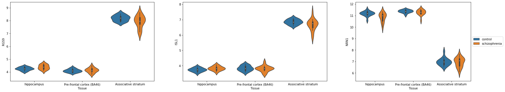
Task 3: Subplots and Facet Grids
Often we want to combine multiple plots into one larger figure for presentations, articles, publications. This is where plt.subplots comes in handy!
Task 3a: Combining Violin Plots into one figure
For Task 2B, we found the top 100 DE genes in order to plot a heatmap. For the top 3 DE genes, let’s compare the expression of control samples vs. schizophrenia samples in each of the three tissues.
Hints - plt.subplots() creates a grid of individual axes. You can access each of these individual axes using indices e.g. axs[0] - sns.violinplot has options for x,y, and hue. Assigning hue to the Disease.state allows for easy comparisons between control and schizophrenia. - You might get too many legends! You can control which axis has a legend using ax.legend().set_visible(False)
def main():
    top_three = top_genes[:3]
    tissues = data['Tissue'].unique()
    data_disease_state_filter = data[(data['Disease.state'] == 'control') | (data['Disease.state'] == 'schizophrenia')]

    fig, axs = plt.subplots()


main()
Task 3b: Combining Volcano plots into one figure
Requirements
Implement the skeleton function to create a figure with three volcano plots for each of the three tissues using both plt.subplots
Highlight significant genes for each plot
Add titles for each of the sub-plots
Hints - Look for axes options in [sns.scatterplot()](https://seaborn.pydata.org/generated/seaborn.scatterplot.html).
hippo_de = differential_expression(hippocampus, "Disease.state",  features=data.columns[10:], reference="control")
pf_de = differential_expression(pf_cortex, "Disease.state",  features=data.columns[10:], reference="control")
as_de = differential_expression(as_striatum, "Disease.state",  features=data.columns[10:], reference="control")

combined_de = [hippo_de, pf_de, as_de]
labels = ['Hippocampus', 'Pre-frontal cortex', 'Associative striatum']

def volcano_plot_combined(dfs, labels, x_col, y_col, sig_col, sig_thresh, fc_thresh):
    """
    Generate a volcano plot to showcasing differentially expressed genes.

    Parameters
    ----------
        dfs : List of pandas.DataFrame
            A list of data frames containing differential expression results
        labels : List of str
        x_col : str
            Column to plot along x-axis, typically log2(foldchange)
        y_col : str
            Column to plot along y-axis, typically -log10(p-value)
        sig_col : str
            Column in `df` with adjusted p-values.
        sig_thresh : float
            Threshold for statistical significance.
        fc_thresh : float
            Threshold for biological significance
    """
    # Helper function to find the adjusted p-value cutoff for plotting purposes
    def find_sig_y(df, x_col, y_col, sig_col, sig_thresh, fc_thresh):
        df['significant'] = False
        def get_direction(fc, p_value):
            if p_value < sig_thresh and abs(fc) > fc_thresh:
                if fc > 0:
                    return "Up"
                else:
                    return "Down"
            else:
                return "Not Sig."

        df["DE"] = df.apply(lambda x: get_direction(x[x_col], x[sig_col]), axis=1)
        sig_y = df[df.DE != "Not Sig."][y_col].min()
        return sig_y


    # Plot each volcano plot onto the same figure
    n_dfs = len(dfs)
    n_rows = 1
    n_cols = n_dfs
    fig, axs = plt.subplots(n_rows, n_cols, figsize=(15,5))

    return axs