Workshop 5: Data Visualization
In this online workshop you will learn the basic components neccessary for appropriate and effective data visualization. In the in-class workshop, you will put this information to test as you create unique data visualization for relevant biological data.
Visualization Philosophy
While science is often thought of as simply running experiments and processing results, communicating those results is one of the most important steps! Data visualization is a pivotal step that not only aids in processing results, but also communicating key take aways. However, not all visualizations are created equal, and poor visualizations may obscure or even mislead important findings.
While not exhaustive, here are few guidelines to consider when making visualizations:
Pick the Correct Plot to Represent Your Data
It is important to pick the plot that best represents the data, and supports conclusions.
Plotting Only Summary Statistics May Lead to Incorrect Conclusions
There are many plots you can use to represent similar ideas. Boxplots, violin plots, point plots, and beeswarm plots can all be used to visualize the distribution of values within a feature. However, some methods may better represent the actual distribution of your data, as demonstrated below. The below image shows the potential danger of only plotting summary statistics (boxplots simply plot the 1st, 2nd, and 3rd quartile) while ignoring the raw data.
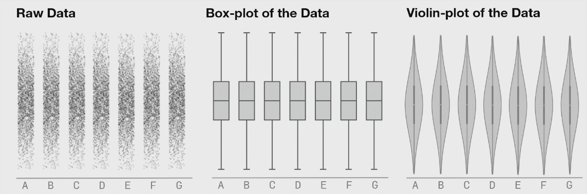
The above plot was taken from https://www.autodeskresearch.com/publications/samestats, and contains more interesting examples showing the potential downside of plotting only summary statistics. Of course, some of these visualizations are easier to interpret than others, and a simpler plot may be better at communicating the main take away. It is important, however, to ensure that such a plot does accurately show the underlying patterns in your data.
Overplotting May Obscure Real Patterns
In single-cell biology, it is common to plot each cell in a scatter plot using some reduced dimension (PCA, t-SNE, UMAP, etc.). This not only allows you to visualize potential cell types in your dataset, but also lets you easily visualize how gene expression patterns may change as a function of cells types. One of these plots, is shown below.
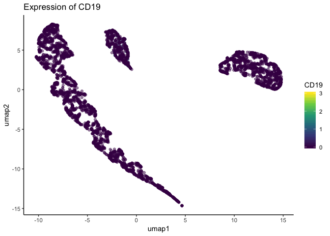
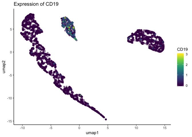
Looking at the above figure, it seems gene expression does not differ from the major clusters in the dataset. However, single-cell datasets are often quite large, and such plots can suffer from overplotting – when one datapoint obscures another. Indeed, the below plot is the same dataset plotted in the same dimensions, but cells are plotted in a different order. Because the order changed, the cells with higher expression were plotted atop the cells with lower expression that were previously obscuring them.
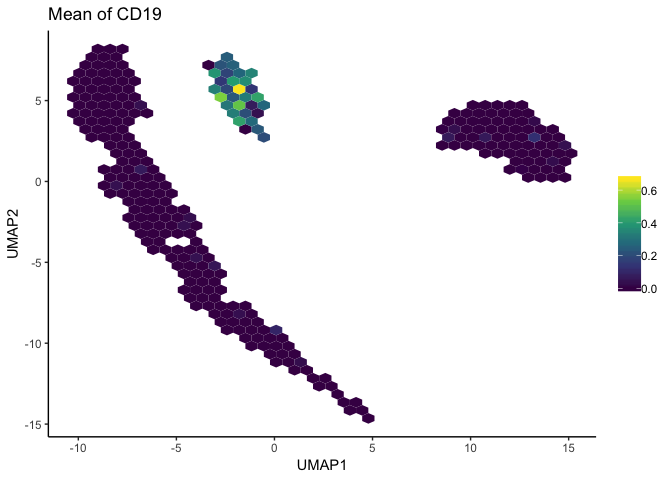
To avoid creating potentially misleading plots, the schex package summarizes neighborhoods of data and plots those summarized areas on a hexgrid. This plot still allows viewers to easily distinguish clusters in the dataset, while also more accurately displaying gene expression patterns.
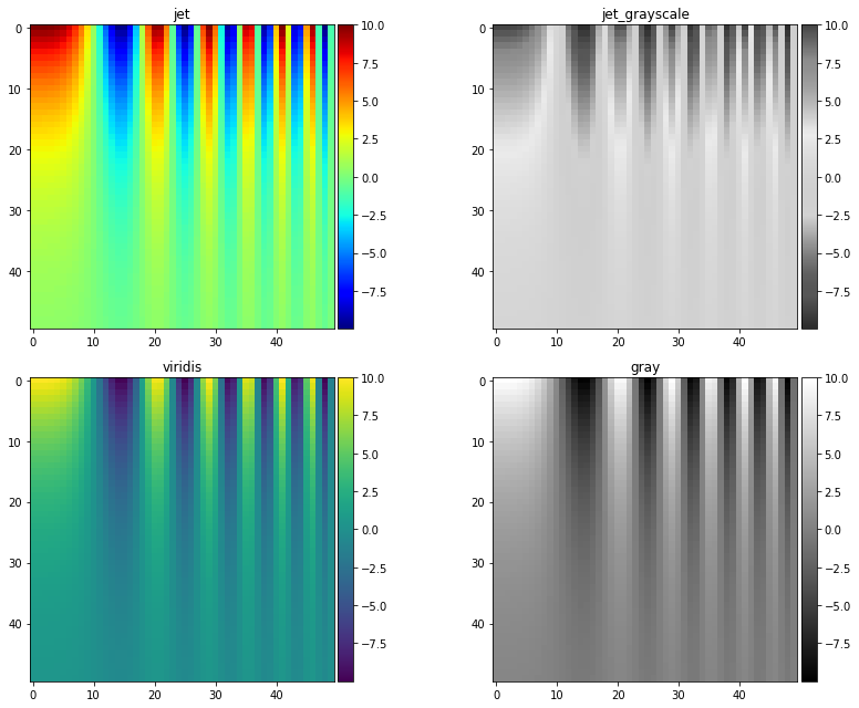
Color Choice May Introduce Artifical Artifacts
The above scatterplots and hexgrids represented gene expression values by plotting different colors along a color map gradient: darker, purple values represented low expression while brigther, yellow values represented high expression. The color map used is known as “viridis”, and is a “perceptually uniform color map”. This means the color map is a monotonic function in lightness (either only increasing or decreasing, but not changing direction), as demonstrated below.

Perceptually uniform color maps ensure that an increase in the raw data by \(x\), will also lead to a perceived increase in color by \(x\). If your chosen color map is not perceptually uniform – such as jet and rainbow color maps shown below – you have no such guarantee, and small changes in data more appear larger or more important than the data supports.

Poorly chosen color maps leading to false conclusions can best demonstrated in the below example:
A matrix dataset is simulated that features sinusoidal oscillations.
The dataset is plotted using four different color maps: jet, a grayscale representation of jet, viridis, and simple gray scale
Both jet and grayscale jet appear to show some ellipsoid-type characteristics near the top of plots.
However, viridis and normal grayscale show these are actually artifacts introduced by the colormaps, instead of representative of the underlying data.
More information on perceptually uniform color maps can be found here and here.
# taken from: https://jakevdp.github.io/blog/2014/10/16/how-bad-is-your-colormap/

import numpy as np
from matplotlib import pyplot as plt
from mpl_toolkits.axes_grid1 import make_axes_locatable

x = np.linspace(0, 6)
y = np.linspace(0, 3)[:, np.newaxis]
z = 10 * np.cos(x ** 2) * np.exp(-y)


def grayify_cmap(cmap):
    """Return a grayscale version of the colormap"""
    cmap = plt.cm.get_cmap(cmap)
    colors = cmap(np.arange(cmap.N))

    # convert RGBA to perceived greyscale luminance
    # cf. http://alienryderflex.com/hsp.html
    RGB_weight = [0.299, 0.587, 0.114]
    luminance = np.sqrt(np.dot(colors[:, :3] ** 2, RGB_weight))
    colors[:, :3] = luminance[:, np.newaxis]

    return cmap.from_list(cmap.name + "_grayscale", colors, cmap.N)


cmaps = [plt.cm.jet, grayify_cmap('jet'), plt.cm.viridis, plt.cm.gray]
fig, axes = plt.subplots(2, 2, figsize=(12, 9))


for cmap, ax in zip(cmaps, axes.flatten()):
    im = ax.imshow(z, cmap=cmap)
    ax.set_title(cmap.name)
    divider = make_axes_locatable(ax)
    cax = divider.append_axes("right", size="5%", pad=0.05)
    plt.colorbar(im, cax=cax)

plt.tight_layout()
Include the Least Amount of Necessary Information
What this means is to include all information necessary to accurately and quickly interpret a given figure, but to leave out excessive annotations that do aid readers understanding. Busy plots are hard to parse. It’s easy to get lost in excessive annotations, and information that was meant to aide interpretation can hinder it. It is hard to set hard and fast rules for what information is necessary in a plot, and what information is excessive. Take, for example, the heatmap plotted below.
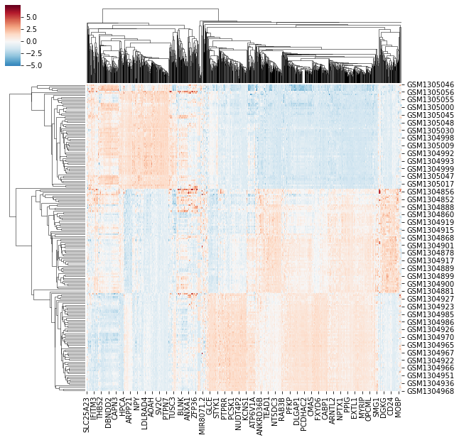
By looking at the heatmap we know two things are being clustered, shown by the dendrogram. We know the two things are different entities – given by different entry labels along the rows and columns. However, we don’t know what they represent (e.g. What does GSMXXXXX mean? And how does it relate to MOBP?). Further, we can se there’s a difference between the value plotted in some regions of the graph, but we don’t know what that value represents. Compare the previous plot with the image below.
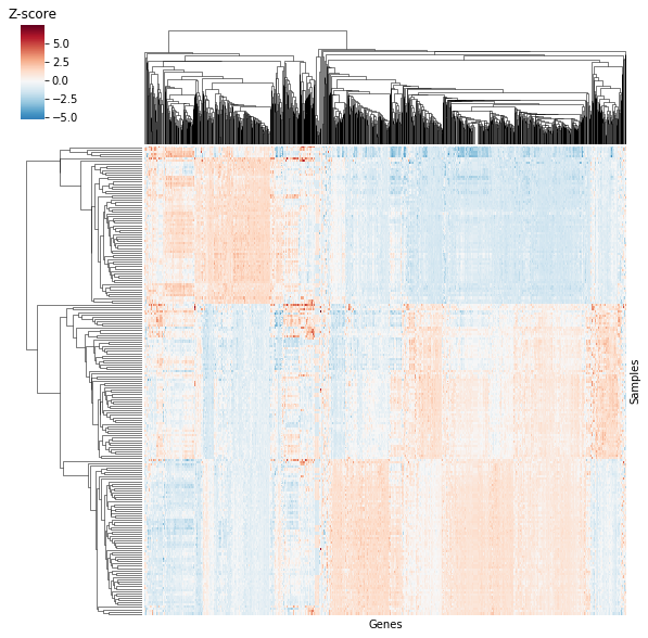
The data is the same as above, but now we know that columns are repsented by genes and rows are represented by samples: we’re looking at a \(sample \times gene\) heatmap! Further, the “Z-score” label by the color bar lets us know we’re looking at standardized expression values. You might think we’re losing information by losing the previous entry labels, but plotted data actually consists of 205 samples and 1000 genes! The previous heatmap definitely didn’t include 1000 gene names or even 205 sample names, potentially misleading readers on both the number of genes and samples.
In the above example, we increase clarity by both removing information (entry labels along the rows and columns) and adding information (labeling rows/columns and labeling the color bar). This is often the type of balance we need to strike when creating clean and clear figures.
Plotting Libraries
While numerical libraries help us generate results, the results would do little good if we were not able to display them in a digestable manner. Thankfully, due to the recent surge in popularity/demand for data scientists and data science tools, there are now more plotting libraries to choose from in the data science ecosystem than ever before.
Plotting Tools in Python
There are many plotting libraries to chose from when plotting in Python. Many of them excel in one area or another, so knowing what type of graph you want to create, how you want people to interact with the plot, and what type of environment you will be working in will help you determine which library is best for your needs.
Matplotlib
Matplotlib is the go-to standard for plotting in Python. It’s a behometh of a package with excellent user control and options that will cover most, if not all use cases. However, extreme user control comes at the cost of a fair amount of overhead compared to other, high-level plotting libraries such as Seaborn or ggplot2 in R.
More information can be found here.
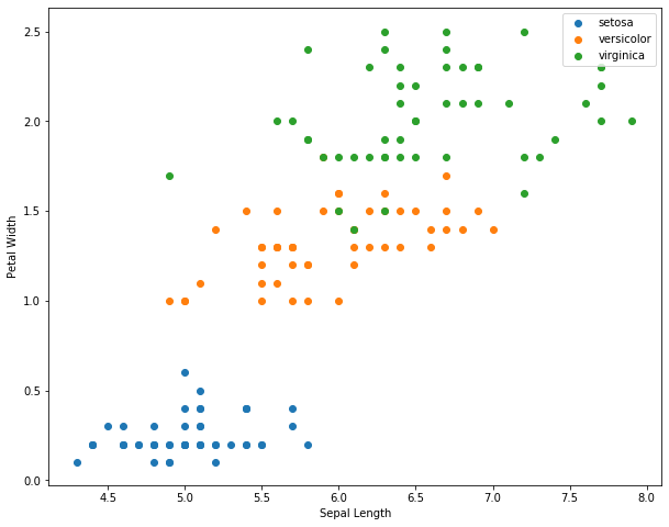
Example:
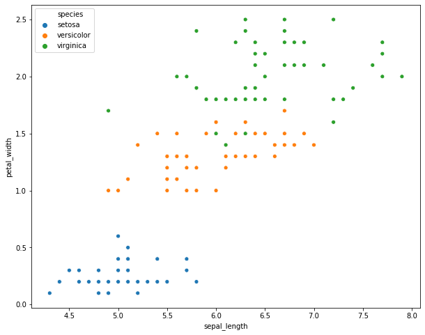
from matplotlib import pyplot as plt
import seaborn as sns
plt.rcParams['figure.figsize'] = (10.0, 8.0)
iris = sns.load_dataset("iris")
for each in iris['species'].unique():
  subset = iris[iris['species'] == each]
  plt.scatter(x=subset['sepal_length'], y=subset['petal_width'], label=each)
plt.xlabel('Sepal Length')
plt.ylabel('Petal Width')
plt.legend()
<matplotlib.legend.Legend at 0x7efd0ca8bba8>
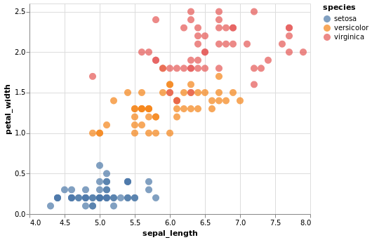
Seaborn
Seaborn is a high-level statistical plotting library that extends matplotlib. All plots are still created using matplotlib, but the seaborn API makes creating interesting plots much more straight forward. This allows users to generate complex plots relatively easily, while still having access to the more in-depth control matplotlib offers.
More information can be found here.
Example
sns.scatterplot(x='sepal_length', y='petal_width', hue='species', data=iris)
<matplotlib.axes._subplots.AxesSubplot at 0x7efd0c816908>
Bokeh
Bokeh is a lower-level plotting library that produces interactive plots made for modern web browsers. It is an extremely useful library if you’re making visualizations for a website, server-backed apps, or any situation where collaborators or viewers would benefit from an interactive plot.
While Bokeh likely has limited use-cases for creating publication figures, it can still be useful during data exploration or when creating a supporting website.
More information can be found here.
Example
from bokeh.plotting import figure, show, output_file
from bokeh.io import output_notebook, show
output_notebook()
TOOLS="hover,crosshair,pan,wheel_zoom,zoom_in,zoom_out,box_zoom,undo,redo,reset,tap,save,box_select,poly_select,lasso_select,"
colormap = {'setosa': 'blue', 'versicolor': 'orange', 'virginica': 'green'}
colors = [colormap[x] for x in iris['species']]
p = figure(title='Iris Morphology', tools=TOOLS)
p.xaxis.axis_label = 'Sepal Length'
p.yaxis.axis_label = 'Petal Width'
p.circle(iris['sepal_length'], iris['petal_width'], color=colors, size=10)
show(p)
Altair
Altair is a higher-level, declarative statistical plotting library that produces interactive plots with less overhead compared to bokeh. However, Altair was specifically designed to work in Jupyter Notebooks and similar technologies (Jupyter Lab, Google Collab, etc.). Therefore, if you do not work in such environments, it will likely have limited use. However, if you do work in such environments, it provides a powerful way to easily explore and visualize data.
More information can be found here.
Example
import altair as alt

alt.Chart(iris).mark_circle(size=100).encode(
    alt.X('sepal_length', scale=alt.Scale(zero=False)),
    y='petal_width',
    color='species',
    tooltip=['species', 'sepal_length', 'petal_width']).interactive()
Plotting Libraries in R
Like Python, R also boasts some very impressive plotting libraries, namely the famous ggplot2 library.
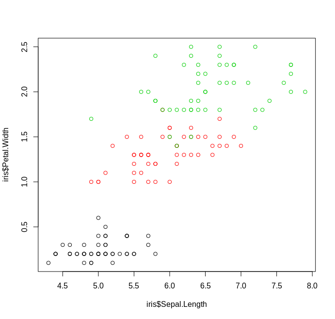
Base R
Unlike Python, R has basic plotting as a part of the standard library. While lacking some the frills of other plotting tools, you can still make clean and readable graphs using basic functionality
Example
plot(iris$Sepal.Length, iris$Petal.Width, col=iris$Species)
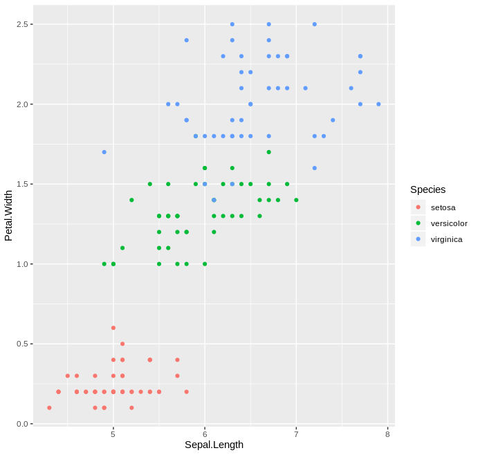
ggplot2
If there’s any package that causes the greatest envy between Python and R users, it is definitely ggplot2. ggplot2 is a declarative plotting library that implements the so-called “grammar of graphics” framework, as expalined in the book Grammar of Graphics by Leland Wilkinson. It is an extremely user friendly package that makes it easy to produce nice and clean looking graphs, while also providing power-users with the ability to easily modify graphs to their liking.
You can find more information about the package here.
Example
library(ggplot2)
ggplot(data=iris, aes(x=Sepal.Length, y=Petal.Width, col=Species)) +
geom_point()
Packages for this workshop
The hands-on portion of this workshop will be done in Python, and we
will be using the matplotlib and Seaborn packages. Installation of
all required packages can be done by downloading the provided
environment.yaml file, navigating to the directory where the file is
located, and issueing the following command in a terminal window:
conda create env --name viz --file environment.yaml
This will install a virtual environment that can be loaded by issuing the following command:
conda activate viz
A virtual environment is just an isolated installion of software – in
this case python packages – that won’t interfere with other
installations of the same software. In this case we’re using a virtual
environment known as a conda environment, but there are other
options out there such as
pipenv.
Matplotlib Basics
As mentioned above, matplotlib is a massive package, and it would be impossible to cover all aspects of the library in a single workshop. For now, we’ll just be going over the extreme basic to get started.
# To interact with matplotlib we first have to import it.
# Generally, instead of importing the entire package, we import the pyplot module
from matplotlib import pyplot as plt # it is cononical to import pyplot as "plt"
import numpy as np # also cononical to import numpy as np, numpy is a numerical library
# get values from -20, 20
x = np.arange(-20, 21)
# calculate the square of each value
y = x ** 2
# plot the values as line plot using the "plot" function
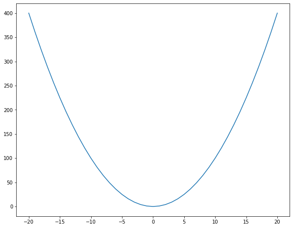
plt.plot(x, y)
[<matplotlib.lines.Line2D at 0x7efce6fe7748>]
Note If you are working in a non-notebook environment (i.e. a python
script or another python interpreter), you’ll need to issue the command
plt.show() in order to view the plot window.
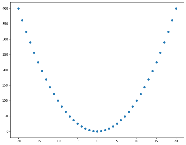
# plot the individual data points using a scatter plot
plt.scatter(x, y)
<matplotlib.collections.PathCollection at 0x7efce6fd4978>
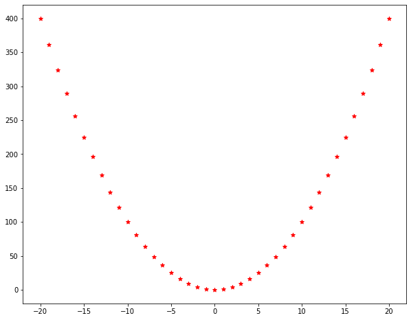
# make the same plot, but with red stars!
plt.scatter(x, y, color='red', marker='*')
<matplotlib.collections.PathCollection at 0x7efce6f447f0>
color="red" and marker="*" are called keyword arguments: they
are optional styling arguments that are set by passing a key (e.g
“color”) and a value (“red”). There are a lot of possible keyword
arguments you can change, but they are generally consistent across
plotting functions.
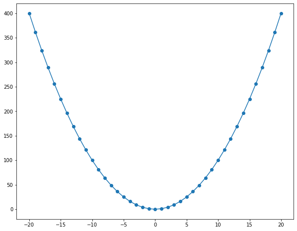
# plot data points as well as the line graph
plt.scatter(x, y)
plt.plot(x, y)
[<matplotlib.lines.Line2D at 0x7efce6f11be0>]
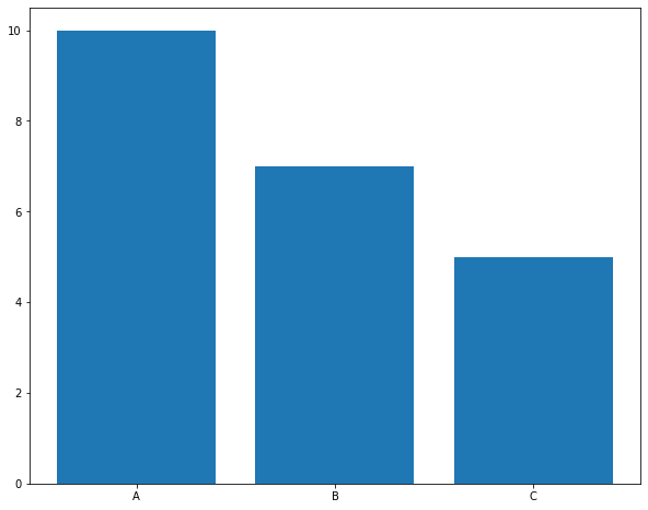
# plot a bar plot of counts 10, 7, and 5 for groups A, B, and C, respectively
plt.bar(['A', 'B', 'C'], [10, 7, 5])
<BarContainer object of 3 artists>
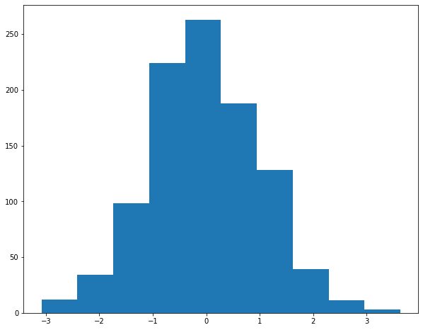
# plot a histogram of sampled values from a standard normal distribution
norm_x = np.random.randn(1000)
__ = plt.hist(norm_x)
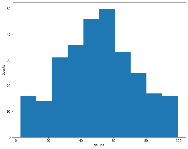
# plot the square of the provided data label
# label axes using plt.xlabel and plt.ylabel functions
data = np.array([55.3846,97.1795,51.5385,96.0256, 46.1538,94.4872,42.8205,91.4103,
40.7692,88.3333,38.7179,84.8718,35.641,79.8718,33.0769,77.5641,
28.9744,74.4872,26.1538,71.4103,23.0769,66.4103,22.3077,61.7949,
22.3077,57.1795,23.3333,52.9487,25.8974,51.0256,29.4872,51.0256,
32.8205,51.0256,35.3846,51.4103,40.2564,51.4103,44.1026,52.9487,
46.6667,54.1026,50,55.2564,53.0769,55.641,56.6667,56.0256,
59.2308,57.9487,61.2821,62.1795,61.5385,66.4103,61.7949,69.1026,
57.4359,55.2564,54.8718,49.8718,52.5641,46.0256,48.2051,38.3333,
49.4872,42.1795,51.0256,44.1026,45.3846,36.4103,42.8205,32.5641,
38.7179,31.4103,35.1282,30.2564,32.5641,32.1795,30,36.7949,
33.5897,41.4103,36.6667,45.641,38.2051,49.1026,29.7436,36.0256,
29.7436,32.1795,30,29.1026,32.0513,26.7949,35.8974,25.2564,
41.0256,25.2564,44.1026,25.641,47.1795,28.718,49.4872,31.4103,
51.5385,34.8718,53.5897,37.5641,55.1282,40.641,56.6667,42.1795,
59.2308,44.4872,62.3077,46.0256,64.8718,46.7949,67.9487,47.9487,
70.5128,53.718,71.5385,60.641,71.5385,64.4872,69.4872,69.4872,
46.9231,79.8718,48.2051,84.1026,50,85.2564,53.0769,85.2564,
55.3846,86.0256,56.6667,86.0256,56.1538,82.9487,53.8462,80.641,
51.2821,78.718,50,78.718,47.9487,77.5641,29.7436,59.8718,
29.7436,62.1795,31.2821,62.5641,57.9487,99.4872,61.7949,99.1026,
64.8718,97.5641,68.4615,94.1026,70.7692,91.0256,72.0513,86.4103,
73.8462,83.3333,75.1282,79.1026,76.6667,75.2564,77.6923,71.4103,
79.7436,66.7949,81.7949,60.2564,83.3333,55.2564,85.1282,51.4103,
86.4103,47.5641,87.9487,46.0256,89.4872,42.5641,93.3333,39.8718,
95.3846,36.7949,98.2051,33.718,56.6667,40.641,59.2308,38.3333,
60.7692,33.718,63.0769,29.1026,64.1026,25.2564,64.359,24.1026,
74.359,22.9487,71.2821,22.9487,67.9487,22.1795,65.8974,20.2564,
63.0769,19.1026,61.2821,19.1026,58.7179,18.3333,55.1282,18.3333,
52.3077,18.3333,49.7436,17.5641,47.4359,16.0256,44.8718,13.718,
48.7179,14.8718,51.2821,14.8718,54.1026,14.8718,56.1538,14.1026,
52.0513,12.5641,48.7179,11.0256,47.1795,9.8718,46.1538,6.0256,
50.5128,9.4872,53.8462,10.2564,57.4359,10.2564,60,10.641,
64.1026,10.641,66.9231,10.641,71.2821,10.641,74.359,10.641,
78.2051,10.641,67.9487,8.718,68.4615,5.2564,68.2051,2.9487,
37.6923,25.7692,39.4872,25.3846,91.2821,41.5385,50,95.7692,
47.9487,95,44.1026,92.6923])
__ = plt.hist(data)
plt.xlabel('Values')
plt.ylabel('Counts')
Text(0, 0.5, 'Counts')
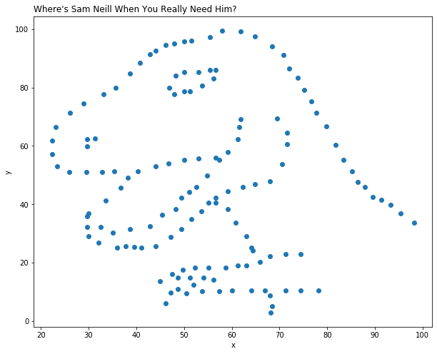
# make the data into a 142 by 2 data matrix
# plot the values as a scatterplot
# label the axes and set a title using the "title" function
hi = data.reshape(142, 2)
plt.scatter(hi[:, 0], hi[:, 1])
plt.xlabel('x')
plt.ylabel('y')
plt.title("Where's Sam Neill When You Really Need Him?", loc="left")
Text(0.0, 1.0, "Where's Sam Neill When You Really Need Him?")
Data Frames
A data frame is a two-dimensional data structure used for storing data tables. It is componsed of lists (or vectors in R) of equal length. Data frames contain a header (column names), row names, and the actual data stored in cells.
Today’s workshop will focus on using data frames in python (using the pandas library), but this data structure is also commonly used in R. For more information on data frames in R, please reference the following resource: http://www.r-tutor.com/r-introduction/data-frame
There are numerous ways for creating a data frame using pandas, and they are enumerated here: https://www.geeksforgeeks.org/creating-a-pandas-dataframe/ Choose the method that works best for your data. An example of creating a dictionary from a set of lists is below:
### Example Data Frame
# Import Libraries
import pandas as pd

# Create Lists of Data
avengers = ['Iron Man', 'Captain America', 'Thor', 'Black Widow', 'Hawkeye', 'Hulk']
num_appearances = [9, 9, 7, 8, 4, 7]
num_lines = [2788, 924, 856, 463, 148, 472]

# Make Data Frame
dict = {'Avengers': avengers, 'Num_Appearances': num_appearances, 'Num_Lines': num_lines}
marvel_stats = pd.DataFrame(dict)
print(marvel_stats)
          Avengers  Num_Appearances  Num_Lines
0         Iron Man                9       2788
1  Captain America                9        924
2             Thor                7        856
3      Black Widow                8        463
4          Hawkeye                4        148
5             Hulk                7        472
More commonly, your data will be stored in an excel or .csv file. In order to work with these data as a data frame, you can read in the data using built-in pandas functions.
# Read in a csv file
#csv_data = pd.read_csv("csv_example.csv")
# Read in an excel file
#excel_data = pd.read_excel('excel_samples.xlsx')
Oftentimes, your tabular data is not stored in this data frame structure, e.g. is “unstacked” and common attributes are spread across different columns. For these cases it is important to be able to reshape your data into the data frame structure. This reshaped data is sometimes called tidy data.
TASK: Read about tidy data here. Understanding effective data pre-processing (tidying) is crucial to efficient data visualization!
Some useful functions for reshaping data with pandas:
stack()
Stack method works with the MultiIndex objects in DataFrame, it
returning a DataFrame with an index with a new inner-most level of row labels. It changes the wide table to a long table.
unstack()
Unstack is similar to stack method, It also works with multi-index
objects in dataframe, producing a reshaped DataFrame with a new inner-most level of column labels.
melt()
Melt reshapes the dataframe from wide format to long format. It uses the “id_vars[‘col_names’]” to melt the dataframe by column names.
Note: In R, it is useful to use the ‘tidyverse’ packages to reshape data!
Types of Plots
Relational
# Load Sample Data
tips = sns.load_dataset("tips")
# Use scatterplot() to generate a scatter plot
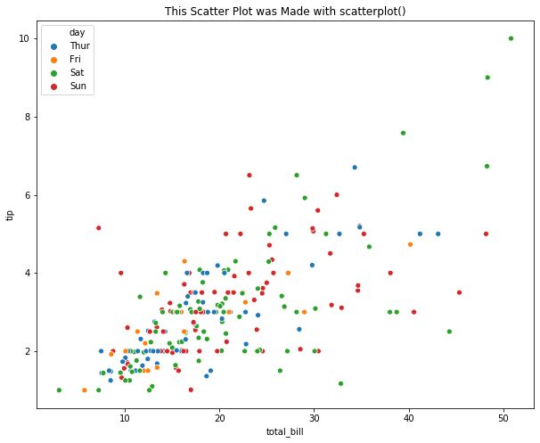
plt.title("This Scatter Plot was Made with scatterplot()")
sns.scatterplot(x="total_bill", y="tip", hue="day", data=tips)
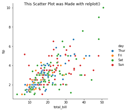
# Use relplot() to generate a scatter plot
g1 = sns.relplot(x="total_bill", y="tip", hue="day", data=tips, kind='scatter')
g1.fig.suptitle("This Scatter Plot was Made with relplot()");
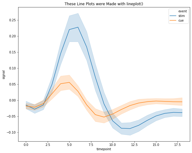
# Load Sample Data
fmri = sns.load_dataset("fmri")
# Use lineplot() to generate a line plot
plt.title("These Line Plots were Made with lineplot()");
sns.lineplot(x="timepoint", y="signal", hue="event", data=fmri)
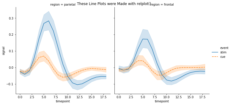
# Use relplot() to generate a line plot
g3 = sns.relplot(x="timepoint", y="signal", hue="event", style="event",
col="region", kind="line", data=fmri)
g3.fig.suptitle("These Line Plots were Made with relplot()");
Categorical
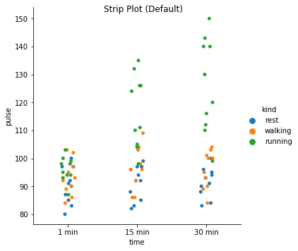
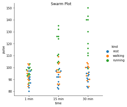
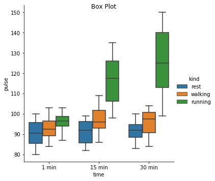
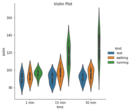
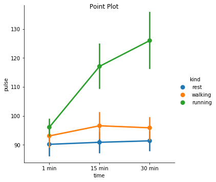
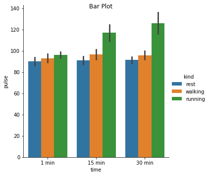
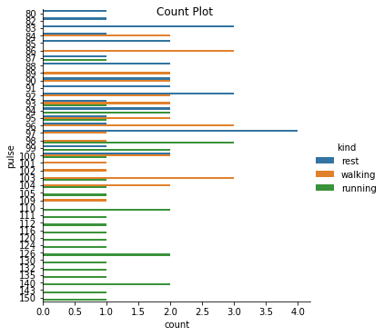
Excercise: Look at the different representations of the data below. Which plot(s) are best suited for showing the relationship between amount of excercise and pulse? Are there any plots that are misleading or innaporpriate?
# Load Sample Data
exercise = sns.load_dataset("exercise")
g = sns.catplot(x="time", y="pulse", hue="kind", data=exercise, kind="strip")
g. fig.suptitle("Strip Plot (Default)");
g = sns.catplot(x="time", y="pulse", hue="kind", data=exercise, kind="swarm")
g. fig.suptitle("Swarm Plot");
g = sns.catplot(x="time", y="pulse", hue="kind", data=exercise, kind="box")
g. fig.suptitle("Box Plot");
g = sns.catplot(x="time", y="pulse", hue="kind", data=exercise, kind="violin")
g. fig.suptitle("Violin Plot")
g = sns.catplot(x="time", y="pulse", hue="kind", data=exercise, kind="point")
g. fig.suptitle("Point Plot");
g = sns.catplot(x="time", y="pulse", hue="kind", data=exercise, kind="bar")
g. fig.suptitle("Bar Plot");
g = sns.catplot(y="pulse", hue="kind", data=exercise, kind="count")
g. fig.suptitle("Count Plot");
Matrix Plots
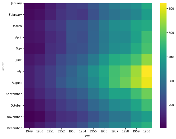
Matrix plots – often referred ot as “heatmaps” – take an \(N \times M\) data matrix and plot each cell value as a specified color. The color of each cell is determine by the value in the cell, and where the value falls along the specific color map – note: a color map is a mapping from a value range (e.g. \([0, 1]\)) to specified colors representing these values (e.g. the closer to zero a number is the more blue it will appear, and the closer to 1 the value is the more red the color will be). In this way, matrix plots allow the visualization of multidimensional data fairly easily. In Bioinformatics, these plots are often used to display gene expression pattens for a large number of genes across a large number of samples.
Example Using the heatmap function in seaborn, plot the number
of flight passengers for each month through the years 1949 - 1960.
# Load in the dataset
flights = sns.load_dataset("flights")
print("Upon loading, the `flights` dataset is 'long' formatted.\n")
print(flights.head())
print('\n\n')
print("By 'pivoting' the dataset, we get a data matrix of (months x years)" +
      " and will be able to plot the data as a heatmap.\n")
flights = flights.pivot("month", "year", "passengers")
print(flights.head())
ax = sns.heatmap(flights, cmap="viridis")
Upon loading, the flights dataset is 'long' formatted.

   year     month  passengers
0  1949   January         112
1  1949  February         118
2  1949     March         132
3  1949     April         129
4  1949       May         121


By 'pivoting' the dataset, we get a data matrix of (months x years) and will be able to plot the data as a heatmap.

year      1949  1950  1951  1952  1953  1954  1955  1956  1957  1958  1959  month
January    112   115   145   171   196   204   242   284   315   340   360
February   118   126   150   180   196   188   233   277   301   318   342
March      132   141   178   193   236   235   267   317   356   362   406
April      129   135   163   181   235   227   269   313   348   348   396
May        121   125   172   183   229   234   270   318   355   363   420

year      1960
month
January    417
February   391
March      419
April      461
May        472
To better visualize patterns in the data, it is often useful to cluster
rows and columns of a data matrix before plotting the data matrix as a
heatmap. In seaborn, this is done with the clustermap() function.
Example To visualize pattens between the number of passengers throughout years and months, plot a clustered heatmap.
sns.clustermap(flights, cmap='viridis')
<seaborn.matrix.ClusterGrid at 0x7efce51ca5f8>
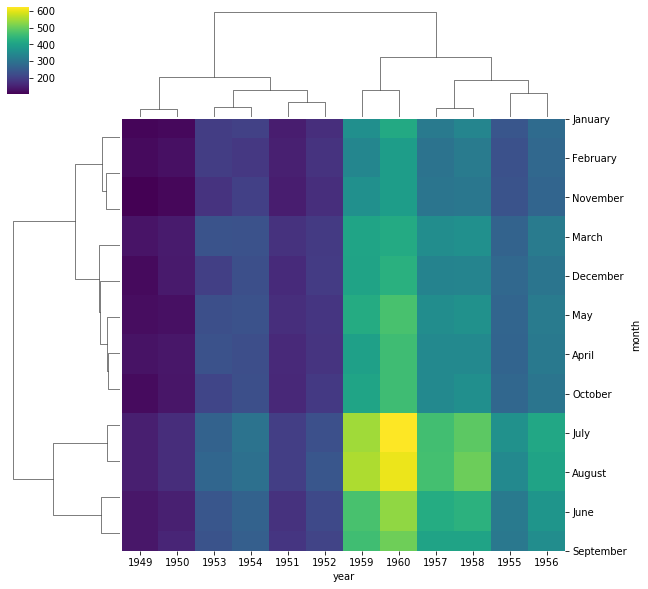
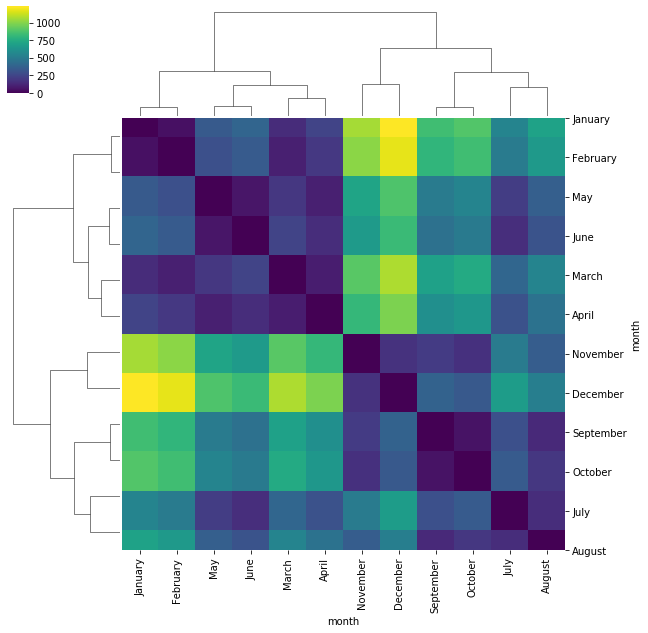
When looking at a heatmap – even when clustered – it can be difficult to adequately visualize distinct clusters. Heatmaps, and clustered heatmaps, can also be used on distance matrices to visualize distances between samples or features to better visualize simmilarity between categories of interest.
Example Plot a clustered heatmap showing the distance between the number of passengers for each month throughout the years.
from scipy import spatial
import pandas as pd
# calculate pairwise euclidean distances using scipy
dist_matrix = spatial.distance.squareform(spatial.distance.pdist(flights.T))
dist_df = pd.DataFrame(dist_matrix, columns=flights.index, index=flights.index)
sns.clustermap(dist_df, cmap='viridis')
/home/dakota/miniconda3/envs/viz/lib/python3.7/site-packages/seaborn/matrix.py:603: ClusterWarning: scipy.cluster: The symmetric non-negative hollow observation matrix looks suspiciously like an uncondensed distance matrix
  metric=self.metric)
<seaborn.matrix.ClusterGrid at 0x7efce503beb8>
Distribution Plots
The basis for all parametric statistical analysis are the underlying
distributions of the sample data. Therefore, it is often informative to
plot the distribution of features of interest. This can either be done
using a histogram, modelling the underlying distribution, or even
plotting a histogram against an assumed distribution for comparison. In
either case, Seaborn makes this easy using the distplot function.
Example
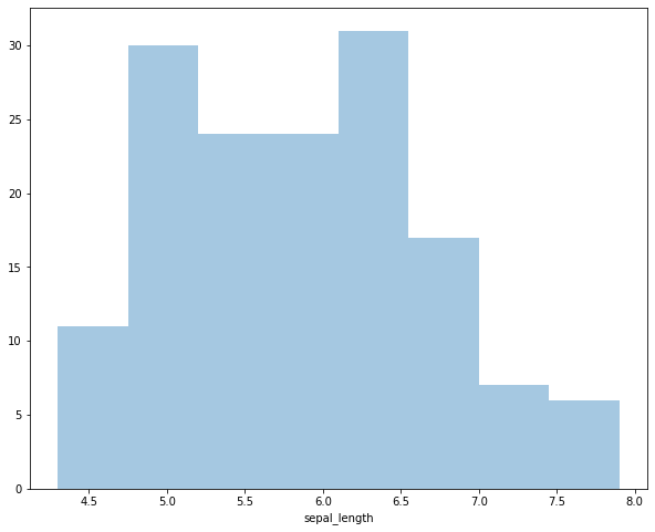
Plot the distribution of sepal lengths in the iris dataset as a histogram.
sns.distplot(iris['sepal_length'], kde=False)
<matplotlib.axes._subplots.AxesSubplot at 0x7efce51ad2e8>
If we prefer to use matplotlib directly, instead of using Seaborn we
can simply use the hist function.
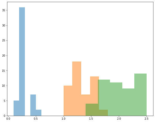
Example Plot a histogram of petal width for each species in the iris dataset. Plot them on the same graph.
for each in iris['species'].unique():
  subset = iris[iris['species'] == each]
  plt.hist(subset['petal_width'], bins=5, label=each, alpha=0.5)
Sometimees we might prefer to plot the estimated distribution with a
probability distribution instead of using a histogram. In Seaborn,
this can be done by setting the parameter kde=True in the
distplot function.
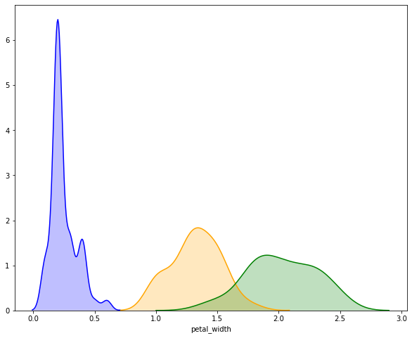
Example Plot the estimated distrubtion of petal width for each
species in the iris dataset. Note: while many Seaborn functions allow
you to pass a vector/Series/array of labels that will automatically
segegrate samples, this is not true for distplot, and we must do it
ourselves.
# create an axes object to plot on
ax = plt.subplot()
colormap = {x:c for x, c in zip(iris['species'].unique(), ['blue', 'orange', 'green'])}
# subset the dataset to each species, plot on the shared axes object.
for each in iris['species'].unique():
  subset = iris[iris['species'] == each]
  sns.distplot(subset['petal_width'], hist=False, kde=True, color=colormap[each], ax=ax,
               kde_kws={'shade': True})
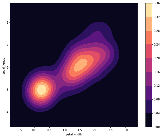
While plotting univariate distriubtions is nice, we can also plot joint
distributions between two random variables. These plots are useful if we
want to see the relationship between two features. To do so using
Seaborn, we simply use the kdeplot function.
Example Plot the joint distrubtion of petal width and sepal length for all samples in the iris dataset.
sns.kdeplot(iris['petal_width'], iris['sepal_length'], shade=True, cmap='magma', cbar=True)
<matplotlib.axes._subplots.AxesSubplot at 0x7efce4f06dd8>
Unlike previous plots, we can not easily plot the species-dependent distributions all on the same graph. Well, we could if we wanted to, but it could get a little messy.
Example Plot a joint distriubtion of sepal length and petal width all on the same graph. Plot each species as a different color.
# create an axes object to plot on
ax = plt.subplot()
# subset the dataset to each species, plot on the shared axes object.
colormaps = ['Blues', 'Greens', 'Reds']
for i, each in enumerate(iris['species'].unique()):
  subset = iris[iris['species'] == each]
  sns.kdeplot(subset['petal_width'], subset['sepal_length'], ax=ax,
              shade=True, cmap=colormaps[i], alpha=0.5)
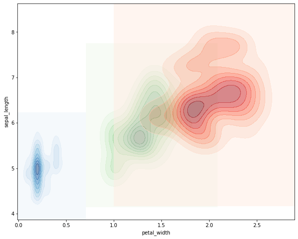
That’s defnitely pretty gross. It would probably be better to plot each
distribution on its own graph and show the three distributions
side-by-side. To do that, we’ll need to use the subplots command
from matplob lib.
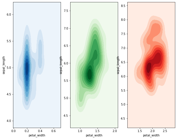
Example Plot the joint distribution of petal width and sepal length for each species on a different graph. Display the plots side-by-side on the same figure.
# create an axes object to plot on
fig, axes = plt.subplots(nrows=1, ncols=3)
# subset the dataset to each species, plot on the shared axes object.
colormaps = ['Blues', 'Greens', 'Reds']
for i, each in enumerate(iris['species'].unique()):
  subset = iris[iris['species'] == each]
  sns.kdeplot(subset['petal_width'], subset['sepal_length'], ax=axes[i],
              shade=True, cmap=colormaps[i])
Seaborn Cheat Sheet
An Example of Exploratory Data Analysis with ggplot
Loading Packages and Data
library(palmerpenguins)
library(tidyverse)
theme_set(theme_bw())
data(package = "palmerpenguins")
Summarize Data
summary(penguins)

##       species          island    bill_length_mm  bill_depth_mm
##  Adelie   :152   Biscoe   :168   Min.   :32.10   Min.   :13.10
##  Chinstrap: 68   Dream    :124   1st Qu.:39.23   1st Qu.:15.60
##  Gentoo   :124   Torgersen: 52   Median :44.45   Median :17.30
##                                  Mean   :43.92   Mean   :17.15
##                                  3rd Qu.:48.50   3rd Qu.:18.70
##                                  Max.   :59.60   Max.   :21.50
##                                  NA's   :2       NA's   :2
##  flipper_length_mm  body_mass_g       sex           year
##  Min.   :172.0     Min.   :2700   female:165   Min.   :2007
##  1st Qu.:190.0     1st Qu.:3550   male  :168   1st Qu.:2007
##  Median :197.0     Median :4050   NA's  : 11   Median :2008
##  Mean   :200.9     Mean   :4202                Mean   :2008
##  3rd Qu.:213.0     3rd Qu.:4750                3rd Qu.:2009
##  Max.   :231.0     Max.   :6300                Max.   :2009
##  NA's   :2         NA's   :2
Make Some Plots
Let’s start by just plotting two of the quantitiative variables against each other
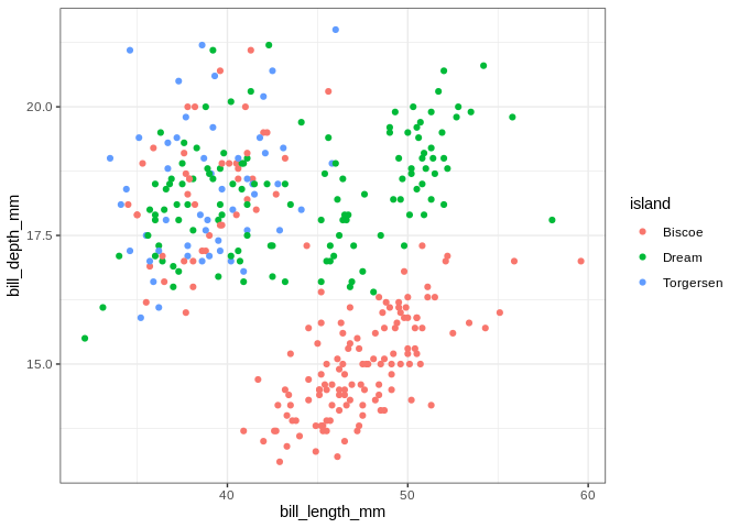
ggplot(penguins, aes(x = bill_length_mm, y = bill_depth_mm, color = island)) +
  geom_point()

## Warning: Removed 2 rows containing missing values (geom_point).
ggplot(penguins, aes(x = bill_length_mm, y = bill_depth_mm, color = species)) +
  geom_point()

## Warning: Removed 2 rows containing missing values (geom_point).
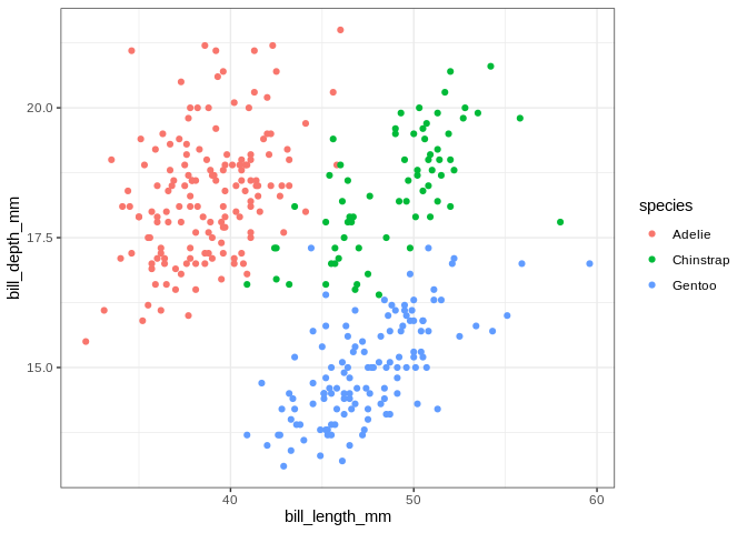
The islands do some work separating the penguins, but the separation is
crystal clear when using species. If we want to make separate
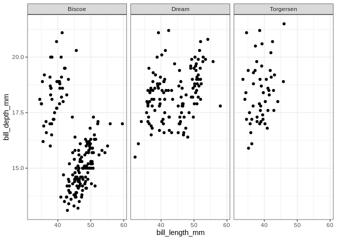
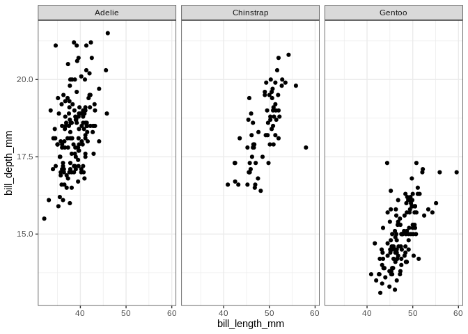
scatterplots for each category in a categorical variable, we can use
facet_wrap
ggplot(penguins, aes(x = bill_length_mm, y = bill_depth_mm)) +
  geom_point() + facet_wrap(. ~ island)

## Warning: Removed 2 rows containing missing values (geom_point).
ggplot(penguins, aes(x = bill_length_mm, y = bill_depth_mm)) +
  geom_point() + facet_wrap(. ~ species)

## Warning: Removed 2 rows containing missing values (geom_point).
It looks like the distribution of species across islands isn’t uniform; let’s make a plot to visualize the interaction between those variables
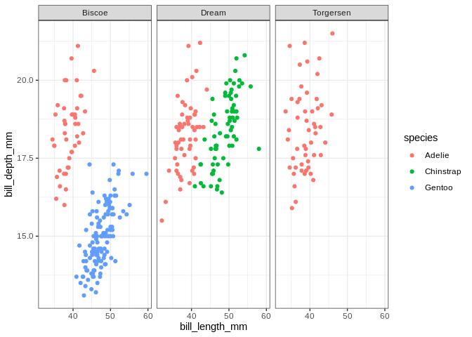
ggplot(penguins, aes(x = bill_length_mm, y = bill_depth_mm, color = species)) +
  geom_point() + facet_wrap(. ~ island)

## Warning: Removed 2 rows containing missing values (geom_point).
Of course, if we’re just interested in the relationship between the species and the islands we can just do a table:
table(penguins$species, penguins$island)

##
##             Biscoe Dream Torgersen
##   Adelie        44    56        52
##   Chinstrap      0    68         0
##   Gentoo       124     0         0
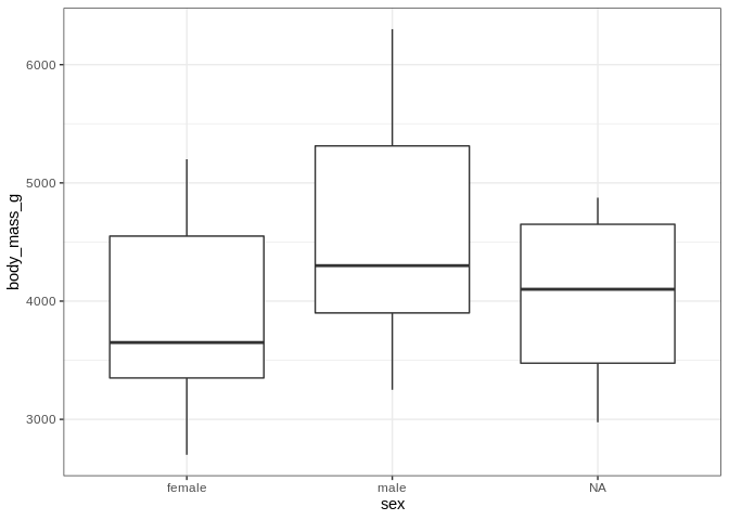
On a completely unrelated note, let’s see how body mass differs by sex
ggplot(penguins, aes(x = sex, y = body_mass_g)) +
  geom_boxplot()

## Warning: Removed 2 rows containing non-finite values (stat_boxplot).
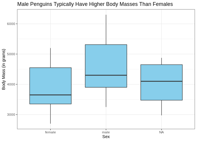
Let’s take a minute to really spruce up the aesthetic appeal of this plot. The axis labels could be a bit nicer looking (who likes looking at underscores), and the plot could use a title. Also it might be nice if the interiors of the boxplots were colored.
ggplot(penguins, aes(x = sex, y = body_mass_g)) +
  geom_boxplot(fill = "skyblue") +
  labs(x = "Sex", y = "Body Mass (in grams)", title = "Male Penguins Typically Have Higher Body Masses Than Females")

## Warning: Removed 2 rows containing non-finite values (stat_boxplot).
Just for fun, let’s see what that looks like as a violin plot
ggplot(penguins, aes(x = sex, y = body_mass_g)) +
  geom_violin(fill = "skyblue") +
  labs(x = "Sex", y = "Body Mass (in grams)", title = "Male Penguins Typically Have Higher Body Masses Than Females")

## Warning: Removed 2 rows containing non-finite values (stat_ydensity).
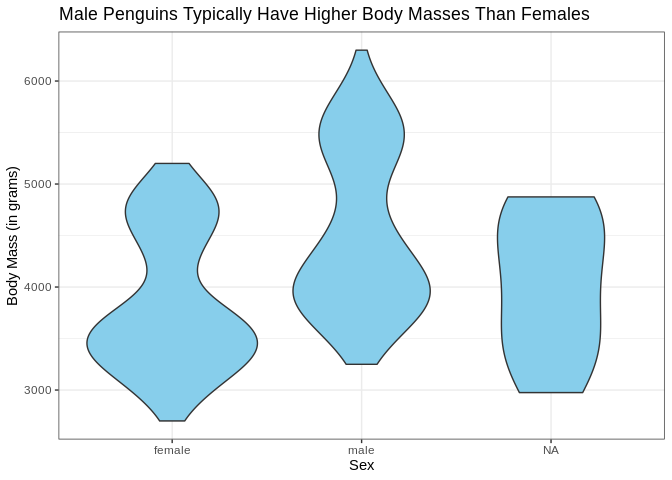
That’s a bit concerning; we’ve got some bimodal distributions going on
here. Once again, let’s use color and facet_wrap to see if we
can find a categorical variable that separates these distributions.
ggplot(penguins, aes(x = sex, y = body_mass_g, fill = species)) +
  geom_violin()

## Warning: Removed 2 rows containing non-finite values (stat_ydensity).
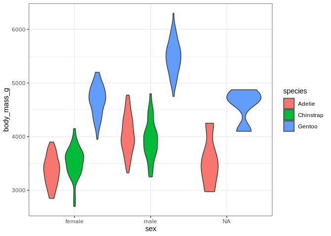
ggplot(penguins, aes(x = sex, y = body_mass_g, fill = species)) +
  geom_violin() + facet_wrap(. ~ species)

## Warning: Removed 2 rows containing non-finite values (stat_ydensity).
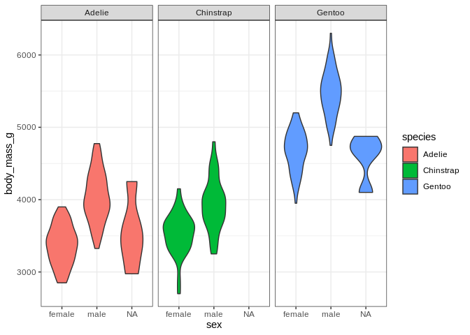
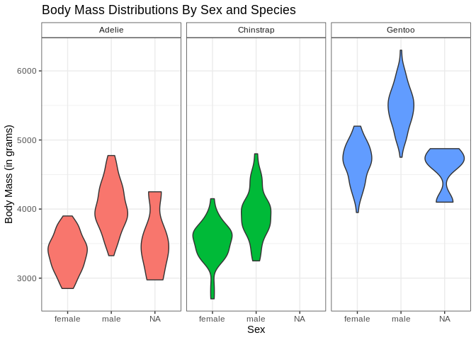
I’ve decided I don’t like the fact that the little boxes with the facet labels are grey and the legend is redunant with the facet labels; let’s fix those (and also bring back the nice axis labels I dropped)
ggplot(penguins, aes(x = sex, y = body_mass_g, fill = species)) +
  geom_violin() + facet_wrap(. ~ species) +
  theme(strip.background = element_rect(fill = "white"), legend.position = "none") +
  labs(x = "Sex", y = "Body Mass (in grams)", title = "Body Mass Distributions By Sex and Species")

## Warning: Removed 2 rows containing non-finite values (stat_ydensity).
theme can do all sorts of fun things; it can be hard to remember all
of the different arguments there are for theme, but it’s usually
pretty easy to google those sorts of things